Scientific Visualization for the Digital Humanities as CLARIN-D Web Applications
July 17, 2013, 13:30 | Long Paper, Embassy Regents D
The importance of scientific visualization for basic and applied research has been recognized as an importance aspect of scientific practise in many disciplines. Recent research trends in the Humanities in general and in Digital Humanities in particular are no exception in this respect (Culy and Lyding, 2010). The goal of the present paper is threefold: (i) to survey different types of scientific visualizations needed for language data, (ii) to describe a set of web applications that have been implemented in the context of the CLARIN–D project [1] , and (iii) to demonstrate the added value of visualization.
CLARIN offers language resources on a large scale, with text corpora often exceeding 100 million words, with spoken and multi–modal data recorded and annotated at different tiers, and with structured language resources of high complexity. In all instances, the querying of such resources will result in new data sets of considerable quantity and complexity. These results are typically rendered in raw data formats that are not conducive to direct inspection by the user. This lack of readability provides a major obstacle for Humanities scholars who are not accustomed to perusing large amounts of data in such a raw, digital form. To overcome this impasse, it is crucial to render data sets in a form that is cognitively more accessible and that highlights the central characteristics of the data in an intuitive fashion.
One area of language–related research where visualization is particularly useful concerns the domain of language variation and language diachrony. The web application CiNaViz (short for City Name Visualization) [2] has access to names and geographical coordinates of 1.162.040 geographical locations all over Europe. With its query interface, researchers can search for specific distributions of city names and visualize them on a map. As an example of language variation, Figure 1 shows on the left the distribution of city names ending with bach (red), beck (blue) and bek (green) in Central Europe. One can see that there are clear separators between the three variations, where the separator between bach and beck follows the so called Benrath Line which divides the nothern from the southern dialects in Germany. The map on the right hand side of Figure 1 shows locations containing the substring schwab. It is evident that these locations are not located in the region called Schwaben (Swabia) today (the region around Stuttgart/Tübingen/Ulm, marked on the map by a blue ellipse). This is because the Swabian people were relocated during the Middle Ages from their original places of residence.
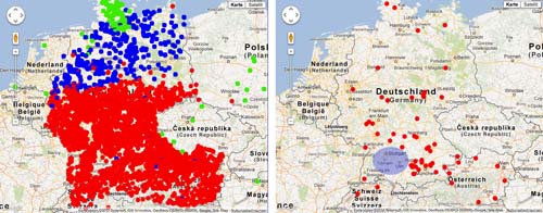
Figure 1:
Visualization of language variation and diachrony
The use of language data is, of course, not only relevant for linguistic and philological research. The social sciences also draw on language data for empirical investigations of various kinds. One area where visualization can help is in tracking the dynamics of culture as reflected in language use. Michel et al. 2010 have coined the term culturomics for this new terrain of digital humanities at the interface of humanities and social sciences. One area discussed by Michel et al. concerns the tracking of celebrity names over time by frequency of mention in the Google Books corpus. Such data are, of course, of immediate relevance for historians, sociologists, as well as researchers in media and cultural studies. While Michel et al. based their visualizations on a very large, closed data set, we have applied the same type of techniques to a much smaller and dynamically updated corpus of news articles harvested from the online news feeds of major German newspapers and magazines.
Our WhoIsInTheNews [3] web application consists of two parts: (i) a web crawler, which downloads German news feeds everyday and extracts the contained named entities with the help of a chain of WebLicht web services [4] . (ii) A graphical user interface to the stored named entities which allows the user to analyze and visualize the appearances of named entities over time and geographical diffusion. For a morphologically rich language like German, linguistic– preprocessing of the raw data is necessary and is performed by a WebLicht workflow which consists of the following automatic annotation steps: tokenization, part of speech tagging and named entity recognition.
Figure 2 shows the occurrences of the names Romney (red) and Santorum (blue) in German newsfeeds over a 12 month timeframe, from November 2011 until October 2012. The visualization captures in a concise way the dynamics of the German news coverage of the two leading candidates in the Republican primaries for the 2012 U.S. presidential election. Despite the sometimes unexpected victories by Santorum in several primaries such as Minnesota, Missouri and Colorado, Romney had a consistently higher coverage in the German media, with Santorum dropping out of the German news alltogether shortly after abandoning his campaign on April 10. The WhoIsInTheNews application shows that visualization techniques can be used not just to plot unrelated career paths of celebrieties as in the case of Michel et al., but also to track the interdependence of such paths in textual materials harvested from online sources in a continuous and incremental fashion.
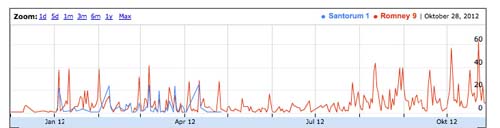
Figure 2:
Tracking of celebrity names over time
The WhoIsInTheNews web application also supports the visualization of named entities that refer to geographical locations. Figure 3 shows the distribution of the 1000 most frequent city names, referenced in the German news feeds harvested over the November 2011 to October 2012 timeframe. Not surprisingly, the density of locations is highest among European cities, followed by the Middle East, the east coast of the United States and the Pacific Rim. Equally noteworthy are the omissions: much of the Midwestern states of the United States, the vast Russian territory outside St. Petersburg and Moscow, as well as much of Africa and South America.
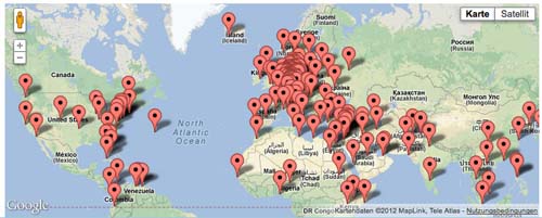
Figure 3:
Tracking the 1000 most frequent city names
Technical realization in CLARIN–D
All visualizations described in this abstract are embedded in the CLARIN–D infrastructure. More specifically, they are implemented as Web 2.0 Ajax driven web applications which make use of annotation web services included in WebLicht [5] , a Servic Oriented Architecture for the orchestration of RESTstyle web services (Hinrichs et al. 2010 and Dima et al. 2012).
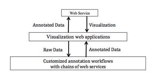
Figure 4:
Embedding web services into web applications
Conclusion and Outlook
Space limitations do not allow us to present the full range of visualization web applications and their significance for Digital Humanities research that are offered in the CLARIN–D infrastructure. For an overview of the visualization tools offered in the CLARIN–D project, we refer interested readers to the WebLicht tools suite (http://weblicht.sfs.uni-tuebingen.de). Therefore, we concentrated on those visualizations that are of relevance to disciplines beyond Linguistics.
The easy web availability of the WebLicht tools is a crucial advantage over existing visualization tools, which typically require expertise in software installation and customization beyond the competence of ordinary digital humanities users. We therefore view web availability as a crucial advantage over existing solutions based on geographical information systems.
References
Notes
2. CiNaViz is freely available as a web application (see http://weblicht.sfs.uni-tuebingen.de/CityViz/). The Java code of CiNaViz is available under the GPL v. 3 generally used within CLARIN–D
3. WhoIsInTheNews can be accessed at http://weblicht.sfs.uni-tuebingen.de/ne/. The source code of WhoIsInTheNews is free available under GPL 3. The only IPR restriction concerns the particular data set of news articles, harvested from the news feeds of German newspapers and further processed by the WhoIsInTheNews application. Scholars who want to utilize WhoIsInTheNews for their own data sets and offer this web application on their own server, are free to do so under GPL.
4. https://weblicht.sfs.uni-tuebingen.de
5. The WebLicht acronym stands for Web based Linguistic Chaining Tool (https://weblicht.sfs.uni-tuebingen.de)