The Design of New Knowledge Environments
July 17, 2013, 08:30 | Panel, CBA 143
1. An Introduction to the Design of New Knowledge Environments
In this panel, we report on our year 4 work in the Interface Design (ID) research team of the Implementing New Knowledge Environments (INKE) project. INKE is a 7-year major collaborative research initiative (MCRI) project funded in Canada by the Social Sciences and Humanities Research Council (SSHRC). INKE is led by Ray Siemens at the University of Victoria, and includes dozens of researchers worldwide. Each year, we have had a different focus for our work. The schedule is as follows:
- Year 1: interdisciplinary citations
- Year 2: corpora
- Years 3 and 4: the scholarly edition
- Year 5: the monograph and journal
- Year 6: born-digital literature
- Year 7: wrap-up and dissemination
For the first three years of the project, our focus has been on a wide range of experimental prototypes. Beginning in year 4, we attempted to aggregate these prototypes into a smaller set of “new knowledge environments”, where the goal is no longer to have a single piece of functionality that we can experiment with, but instead to begin imagining how the various pieces of functionality, as represented by our prototypes, can work in concert to produce an environment for people working with electronic books.
What makes these environments “new” is that they are comprised of a set of experiments into working with digital text. More often than not, these experiments involve the design and programming of a prototype, which may exist at any one of a range of levels of fidelity. Ideally, the lowest level of fidelity is developed that is necessary in order to come to grips with the central idea. To develop further is sometimes required in order to achieve an adequate user experience study, but in any case it is important to keep in mind that the end goal is the extension of our understanding rather than the production of a piece of stable software.
So the process is to conceive of a concept and produce a prototype to help us better understand the concept. Typically a prototype will generate some new knowledge itself, and that knowledge can contribute to the next iteration of the idea. In some cases, the prototype teaches us enough that there is no need for a further prototype. If what we’ve learned is of potential use, then we can consider a more robust implementation of the idea. If what we’ve learned is that the line of thought we’ve been pursuing may not be fruitful after all, then we can at that point abandon the trajectory and move to another idea.
In the case of the year 4 projects in INKE, we have selected some prototypes that we think deserve to be aggregated into an environment. We are at the same time trying to learn what we can about the theoretical and technical issues involved in this kind of redesign and reprogramming for the purposes of aggregation. These are environments rather than simpler tools in the sense that they afford more than a single task or set of tasks.
In the papers that follow, we describe each of the environments, examine the state of the art in scholarly editions for tablets, and discuss the user experience study of two of the prototypes that have gone on to inform one of our new knowledge environments.
2. Reading Skins: Voyant and Tool Aggregation
Tools are not just ways to ask questions - they are also reading skins. Interface designers have known this for some time. They design interfaces to present affordances and views that facilitate different types of reading. A dictionary is designed for consultation reading (Blair 2010), a manual for training. Likewise an e-book minimizes distractions, presenting “just the text”, while text analysis environments embed the texts in alternative ways of reading, from visualizations to interactive controls. These design choices are based on a model of the reader and the tasks they are engaged in. In this paper we will look at the types of interfaces or “skins” presented by text analysis environments and end by discussing the decisions taken in the design of Voyant. We will do that in the following ways:
- 1 First, we will look back at one of the first computing humanists to consider visualization and the interface to text analysis tools, John Smith.
- 2 Second, we will survey different types of text analysis interfaces.
- 3 Third, we will close by discussing how the architecture of Voyant is designed to allow for different reading skins that aggregate different tools to suit different uses.
1. First Thoughts on the Interface
One of the first computing humanists to think about the interface to text analysis tools was John Smith. John Smith in “Computer Criticism” and other articles proposed a way that analytical tools like his ARRAS could fit into interpretative research practices. He saw the computer as a tool to help identify and then trace structures through a text and gave an example of how this can help rereading a text in his article “Image and Imagery in Joyce's Portrait.” In “A New Environment For Literary Analysis” he explicitly discussed how the analytical tool ARRAS was not meant to replace the inquirer but to amplify them, how it could provide what we today call visualizations, and how it should be thought of not as a program, but as an environment for work where one could switch from text analysis to editing the text or sending a message. In the presentation we will go into more detail about how Smith articulated the relationship between tool design and interpretative practices.
2. Survey of Type of Interface
In the second part of the paper we will survey various interface paradigms for text analysis tools including:
- ARRAS: We will start with the interface John Smith developed for ARRAS, and discuss his ideas for a humanities accessible command line language.
- TACT and TACTweb: We will then discuss TACT, which was released in 1989 and designed by John Bradley and others (Lancashire 1996). TACT, while running in MS DOS, was influenced by the then new idea of a Graphical User Interface (GUI). It had a primitive windowing model that let you split the screen to see multiple displays and use one to drive the other(s). TACTweb, which came later, brought TACT functionality to the web, and illustrated for the first time how the web separated interface from text database so that multiple interfaces could be built.
- HyperPo: While HyperPo (hyperpo.org) wasn’t the first text analysis environment on the web, it was one of the first to fully exploit the web. It let you upload a text and it provided a number of innovative features including making displays themselves affordances for further interaction. It was also explicitly designed as a reading environment.
- TextArc: One of the most beautiful interfaces to text analysis is the TextArc (textarc.org) visual concordance designed by W. Bradford Paley. This work pushes the idea of interface in interesting directions as it can be considered a work of art or design meant to be appreciated in and of itself rather than as a window onto something else.
Other interfaces could be mentioned like the visual programming interface idea of Eye-ConTACT that is also available in SEASR or the library interface of the MONK project, but these are more management interfaces than reading ones.
3. Voyant and Skins
In the last part of the presentation we will discuss the layered architecture of Voyant that allows one to create different combinations of tools into “skins” that aggregate different tools. A Skin Builder tool for creating your own skins will be demonstrated and different examples of skins for different reading purposes will be shown. Different uses call for different combinations of tools.
All of these text analysis interfaces are presented from the perspective that they are views on a static object that is studied, but what if the object of study is changing? What if we think of text analysis tools performing the text rather than skin it? The presentation will end with an alternative prototype interface designed not for reading, but for animating the text as if it were a performance.
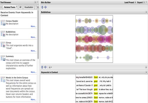
Figure 1 -
Voyant Skin Builder
References
3. Designing the interface within the interface: legibility and readability in the Dynamic Table of Contexts
“Typography is to literature as musical performance is to composition: an essential act of interpretation, full of endless opportunities for insight or obtuseness.”
As humanities scholars transition from reading traditional print texts to reading on computer screens, ebooks and tablets, we are discovering that the visible word has taken a step backwards in quality. Typographic considerations are often the most challenging aspects of user experience development of digital reading environments. Ereaders are still in their infancy, and thus far little attention has been paid to textual design beyond very basic choices of typeface and font size.
We have developed the Dynamic Table of Contexts, a text analysis environment that combines the traditional concepts of the table of contents and index to create new methods for Humanities scholars to read and interact with digital text. The main interface consists of four interactive panes that perform dynamically with each other: the table of contents, the index, the xml tag list and a large pane to read the text itself (see Figure 1). In addition, there is a pane for reader notes. The Dynamic Table of Contexts interface is predominantly textual in nature, but the text at the centre of it is itself an interface – the point of interaction between the reader and that which is read. This study examines the appearance and arrangement of the textual interface within the larger interface. We asked: how can we typographically optimize the ereading experience?
The guiding fundamentals of typography are legibility and readability. Legibility concerns the ease with which a letterform can be recognized and readability refers to the ease with which text can be understood (Lupton 2004). Many problems with legibility have arisen in the transition from print to screen. For example, rather than black ink on a paper page, black text on a screen is an absence in the glowing pixels that surround it, and the result is perceived as blurry regardless of screen resolution. Anti-aliasing is used to compensate for low resolution on most computer monitors but can't be applied consistently from character to character because of where the letter may land on the physical pixel grid. In an effort to offset this problem font size is often increased, which in itself can become a reading irritant and navigationally awkward as larger type creates shorter lines of text which in turn requires more left-right eye movements from the end of one line to the beginning of the next. Fewer lines of text also necessitate more scrolling which is visually uncomfortable and requires additional time and visual energy for the reader to relocate himself in the text after each movement. While we wait for technology to catch up in these areas, this study outlines the methods we used to minimize legibility issues and discusses which existing typefaces (most of which, it must be remembered, were never intended for the screen) best counteract blurring and movement. We identify optimal type size and line length combinations for comfortable extended on-screen reading in the Dynamic Table of Contexts.
Compared to legibility, issues of readability are less often addressed in discussions of digital reading environments. Readability is comprised not only of the arrangement of type on a page or screen, but also of attention to the entire visual entity and all the complex relationships between levels of type, symbols and images (Berryman 1984). Typography imparts semantic meaning as it interprets content and influences meaning by creating hierarchies, assigning values, and manipulating emphasis (Bachfischer, Robertson and Zmijewska 2007). Our investigations into optimal readability design for the Dynamic Table of Contexts raised interesting questions about the representation of text and the process of reading on-screen. In the remediation from print to screen, do we still read the same way? Do the rules that apply to the readability of print typography apply to on-screen typography? Do conventions that govern readability of websites also apply to extended reading of scholarly materials?
In this study we have also examined other components of the textual interface that affect readability but that are not necessarily typographic in nature. Often on-screen paging representations (such as a simulated left and right sides of a double page spread or an animated page turning) give the illusion of a traditional print book. We examine theories of whether these provide valuable perceptual cues to the reader or are simply a vestigial device that has lost its significance in a changing environment.
This research represents a move from an adequate to an optimized reading environment.
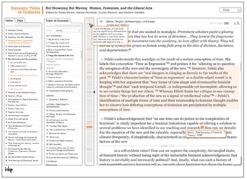
Figure 2 -
Dynamic Table of Contexts
References
4. The Tablet as a New Medium for Scholarly Editions
How have scholarly editions been implemented on tablets? In the past few years, a significant number of scholarly editions have seen deployment on the Web, and the differences between printed editions and Web-based ones has become a matter of attention for many scholars. In this paper, we will investigate scholarly editions as they appear in tablets and other mobile devices.
Web-based scholarly editions offer many new features that do not and cannot exist in printed ones. Such features include opportunities for collaboration with other users or with the editors of the work, innovative methods to search and browse, specialized tools and visualizations for text analysis, means to customize the layout of the interface and the content, options to change the language of the interface or to see translations of the text, high resolution zoomable images, multimedia elements such as video and audio, and a wealth of material that would be too costly or cumbersome to include in a printed edition.
Despite these advantages, some users still prefer their scholarly editions to be in paper form. Reasons may include a lack of physical distance between reader and book, and the ability to interact directly with the material. Tablets have solved these problems to some extent, emulating the physicality of paper books, and allowing users an opportunity to touch and feel them. As Elena Pierazzo notes, “Usability studies have demonstrated that reading on tablets is more enjoyable than reading on the screen of computers and, in some cases, more than reading print” (Pierazzo 2011). Additionally, the fact that an app is an independent program housed on a particular machine results in increased speed and stability over Web-based editions, which also serves to reproduce some of the positive features of paper-based editions (McDayter 2012).
Tablets represent a return to printed editions in some more negative respects as well. For instance, users cannot create shared annotations or collaborate with each other in other ways; the app on the tablet is isolated from references and related material available on the Web; tools for text analysis are absent; and no options are provided to show the interface in different languages. Part of the reason for these omissions in tablets may be due to the fact that editions that are currently available on tablets have generally been produced more for a popular audience than a scholarly one. This is reflected not only in terms of functionalities of the interface, but with respect to the content as well. Bibliographies, glossaries, and textual apparatuses are typically missing, variants tend not to be included, and notes and annotations have been recycled from older print-based editions, rather than being the result of new scholarship. Tablet-based editions are often more focused on making an edition attractive and amusing than on making it scholarly, and may include games or quizzes, methods of sharing passages or images via social media sites, and other innovative but potentially distracting features likely to be of interest to keen fans of the material rather than to scholars.
So, tablets are in a way mediating between print and the Web, sharing some of the advantages and disadvantages of both. But what effects will these advantages and disadvantages have on scholarly editions? Do scholarly editions have a future in tablets? These are questions that we will discuss in this paper.
At this point, very few tablet-based scholarly editions have been released, and as discussed above, those that have are decidedly unscholarly in some respects. Touch Press has produced some notable examples, including editions of T.S Eliot’s The Waste Land, Leonardo da Vinci's notebooks, and Shakespeare’s sonnets. The Waste Land is the first edition produced by Touch Press, and continues to stand up as a nice example of the genre. This edition allows the poem to be viewed as plain text, and includes annotations, audio recordings, facsimile images of the original typescript, filmed performance of the poem, interviews about the poem and some image galleries.
Many of the features provided in The Waste Land would make using scholarly editions easier and more pleasurable. As is the case with most works of philosophy, art, and literature, The Waste Land is multi-layered, and multimedia is of great help in exploring, finding and analyzing the different existing layers. Study is also eased and enhanced by being able to quickly and easily reveal or hide information, switch between viewing multiple encodings of the text, and simply by having the ability to manually scroll through the text, rather than having to use a device.
With what has been discussed, some questions require further exploration. Will the advantages of tablet-based editions win out over their disadvantages? Will the tablet become accepted as an appropriate medium in which to produce and study scholarly editions? In this paper, we will consider whether scholarly editions have a future on tablets and how such a future might look.
References
5. Designing for Multi-Touch Surfaces as Social Reading Environments
The INKE Interface Design group has been exploring the application of multi-touch table technology for improving the comprehension, manipulation, and analysis of variorum editions beyond what has been accomplished in previous digital variorums. These volumes consist of three general components: the text of the work itself as selected by an editor; a list of variations between this ‘base-text’ and other manuscript or printed versions; and a comprehensive anthology of previous scholarly annotations on a particular line, passage, or the entire work. For many texts the existing notes are so extensive that it is difficult in a print medium to present “…simultaneous access to text and relevant commentary”, leading to an effort since the mid-nineteen-nineties to produce digital variorum editions (Werstine 2011).
Scholarly editions, especially variorums, raise interesting questions about the representation of elements and the act of reading. The richness of this type of edition creates dilemmas related to the organization of different pieces of information, as well as interacting with the text. A print version presents physical space constraints, such as the two-page spread and the necessity of linear presentation. This constraint become less of an issue in a digital environment, where space, time, and dimensionality in general are more fluid.
Although current iterations of digital variora (for example, the Online Chopin Variorum Edition, and the Electronic Variorum Edition of Don Quixote) attempt to take advantage of this flexibility of the medium, they present themselves as flat webpages, losing physical engagement with the materiality of the book. In order to bring back fuller physicality, we have used multi-touch surface technologies to simulate the “real space”, and to return to full gestures as opposed to clicks. A few projects focusing on eBooks and tablets have begun to emerge with the same idea (for example, The Wasteland, Shakespeare's Sonnets and Kerouac's On the Road), but this technology has not yet been applied to variorum editions.
Our project, The Comedy of Errors Tangible Variorum, involves creating a tangible user interface representing the Modern Language Association’s variorum edition of Shakespeare’s Comedy of Errors in order to explore the affordances of this technology to increase collaborative scholarly research and interpretation of the material.
Existing digital variorums have attempted to encourage collaboration and interaction by incorporating features into their web page interfaces. In the Electronic Variorum Edition of Don Quixote (EVE-DQ) from Texas A&M’s Cervantes project, for example, users can add their own commentary and annotations which can then be accessed by future users. Similarly the Online Chopin Variorum Edition (OCVE) in progress at King’s College London allows the attachment of notes to the base text with an option to share them publicly. For both projects, however, adding comments is an individual activity, with a single user at a workstation inputting notes with a mouse and keyboard. There is little room for group interaction, and any that exists must be sequential rather than communal. Most previous electronic New Variorum Shakespeare (eNVS) projects, particularly the recent Winter’s Tale version, have no digital annotation function at all, limiting them to use as a reference tool, rather than an interactive platform.
Furthermore, it can be exceptionally difficult to allow simultaneous visual comparison of the numerous features of a variorum on these web page formats given the small size of most screens. A study by Wästlund, Norlander, and Archer on the effect of page layout on mental workload shows that “manipulating an onscreen text document via scrolling necessitates a shift of focus from the text to the action of controlling the page movement,” (Wästlund, Norlander, and Archer, 1243) leading to decreased performance on reading comprehension tasks. Vandendorpe (2009) writes that “navigation by means of a mouse tends to give rise to chaotic, extremely rapid movement that is not very favorable to reading” (133).
By using a multi-touch table as a display device this project attempts to solve the problems of poor collaboration and broken comprehension. There has been significant research supporting the use of touch screens in improving reader focus, for example a study by Eva Siegenthaler et al. (2012) found that subjects performed better at various tasks involved in reading when using devices with tangible inputs, concluding that “a touch screen allows for an easier and more intuitive interaction” than a non-touch screen (Eva Siegenthaler et al. 2012, 94). The sizes of both the screen and the table perimeter of a multi-touch device, meanwhile, are conducive to multiple users working together. We thus believe that the application of multi-touch technology will have two effects. First, it represents another stage in the remediation of variorums, one that will better allow us to implement Unsworth’s (2000) scholarly primitives: to sample, compare, discover, represent, annotate and reference different versions of the base text. Simultaneously, it encourages these tasks to be performed socially, deepening understanding by incorporating multiple viewpoints.
The collaborative uses of tangible devices in research situations is one of the main goals of this research. In driving towards this end, however, our group has faced issues in two camps: the ability of users to adapt to multiple people concurrently using touch controls; and, less expectedly, the ability of a designer to structure elements on an unconventional screen.
From the perspective of users, much of the challenge is about breaking habits. Since the introduction of personal computers, users have learned how to interact with the machine in individual work spaces. The adoption of this concept is so intense that one is liable to think that group work is less effective than work alone with the computer. However, it is noticeable that the technology has determined this situation: people cannot work together because the machine allows just one input at a time. The questions that we raise are: what happens when more than one person can interact with the machine? What kind of operations and collaborations can a group perform when all of them are engaged with the same machine in the same environment?
For designers, learning to think beyond the confines of a screen and mouse proved to be a major obstacle. The original design conceived of the mutli-touch screen as being suspended on the wall, and the elements were placed accordingly (Figure 1). As we built and tested the interface it became clear that the layout would be effective for a single user, but was not ideal for the collaboration we were trying to achieve. While flipping the screen to a table was a logical choice to allow more users to work simultaneously, reassessing the design from that perspective resulted in a number of questions: where do you place touchstone elements when there is no clear top or bottom? How can items being used by different people overlap without disrupting anyone’s work?
This paper explores the problems faced when building a social reading environment, both for users and for designers. The technology to allow such interaction exists: a multi-touch table has a size that allows for the display of multiple documents side-by-side, and its status as a touch screen enables easy and intuitive operation, lessening the mental workload required to operate it and permitting users to focus on the content rather than the interface. The system accommodates familiar gestures such as touch, pinch and flick to let the user move, select, grab and scroll through information on the screen, and since more than one point of interaction is possible, multiple people are able to work at the same time in the examination of the material, improving collaborative work. Designing for these features, however, is a mental challenge that requires an upset of standards in the minds of all those involved, users and builders, and facing these problems is a necessary step in moving towards the future of collaboration.
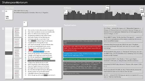
Figure 1 -
Initial view showing chosen copy text in a full view and a reading panel. All variants and commentaries on the chosen page are marked. More to the right there are views of all textual notes and commentaries connected to the chosen part of the copy text. At the top there is a representation of all editions in chronological order, in which the dark bars shows the overall difference of a particular edition to the chosen copy text.
References
6. Managing the Editorial Process: A Study of the Structured Surface Workflow Prototypes
Introduction
The INKE UX researchers have recently completed a user experience study of the Structured Surface Workflow prototype (see Frizzera et al. 2012). Although data analysis is ongoing, many interesting results are emerging. The majority of users, for example, imagined unanticipated ways of employing virtual workflow spaces for greater collaboration, openness, and re-humanization of the sometimes overly impersonal, email-based editorial process. This paper will discuss the findings of the study, and also suggest new ways to approach user experience studies within the digital humanities in order to maximize the use of time and participant resources. The results of and experience from the Workflow study findings can inform not only the development of future editorial prototypes but also the design and testing of prototypes in the Digital Humanities more generally by importing other well-established UX testing and research practices at earlier phases of design.
Study Background
Two closely related prototypes were tested simultaneously in the user experience study. The first, Workflow Editorial Edition, was designed to facilitate the digital document editing and publication process. Describing the goals of the program, Frizzera et al. (2012) remark that the design metaphor is:
derived from the flowchart of activities that an editor can use to manage the movement of a submitted article or other item of text (such as a book review) through the stages from its initial appearance in the editor’s inbox to the final step where it is ready to send to the printer. (n.pag.)
Indeed, the prototype has a flowchart-like appearance, reminiscent of index cards affixed to a corkboard (see Figure 1).
On this structured surface users position and move small circles, representing locating pins within the context of the flowchart metaphor and representing articles within the actual journal editing process. The use of familiar business and office metaphors is a well-established technique in interface design (e.g., Nadin 1988).
The second prototype employs the same “structured surface” metaphor but expands the possibilities for tracking and managing the progress of an article through the interface. Orlando Workflow is a customization of Workflow Editorial Edition for the document writing and markup process in Orlando: Women’s Writing in the British Isles from the Beginnings to the Present (see Figure 2).
Integrating expanding pins with details, state, and history-tracking functions, the design of the Orlando Workflow relies less heavily on position-based information, privileging instead the information associated with each pin.
Procedures and Instruments
Participants were asked to: 1) complete a number of tasks in both the Workflow Editorial edition and Workflow Orlando edition prototypes; 2) provide “think-aloud” feedback while completing the task list items; and 3) complete a survey about the experience, one for each edition of the prototype. The study instruments included: a web-browser-based help page; a separate Likert-scaled experiential survey for each prototype; a demographics survey; and a task-list to establish common points of contact with the prototype across the participant population.
The need for more participants who had experience with the Orlando project was identified early on in the study. Without such experience, some participants were disoriented by the many acronyms and Orlando-specific terminology. The Vancouver research team developed an extension of the study to be run independently at University of Alberta (Edmonton) so that Orlando team members could be recruited as participants. With the support of the Orlando project, the Workflow user experience study successfully implemented the study extension using digital tools and communication only. The advantages and challenges of this collaborative user experience study will be briefly treated below.
Contributions to the Field of Knowledge
The preliminary findings suggest three effective directions for future designing and testing of editorial team management software. The first relates to the central focus of the Workflow prototype. Tracking the communication and human relationship dimensions of the editorial process was reported to be the greatest source of anxiety for editorial team leaders (viz., the prototypical user of the editorial Workflow). As one participant described it (narrating his thought process whenever he works on an editorial team):
I know we talked about this with five different people but who are the other three? So I’m busy there hunting my email to track that stuff down. And I’m constantly in a small state of anxiety because I’m going, oh god, if I forget somebody - I feel I’m being incompetent or something. (Participant 6044)
The second is the actionable behaviors of the program: many users want to automate the actions of the prototype so that the possibility of human error is reduced. Indeed, participant 6044 (cited above) goes on to recommend that the interface be redesigned as a mediator among the different communication and scheduling features already available on a computer, in order to help a user manage these small but anxiety-causing features of an editorial project.
Finally, certain common problems that many users shared with the prototype such as the size and arrangement of many of the elements suggests a way to improve present usability testing practices.
A Call for Earlier User Experience Testing
It is clear from our results that digital prototyping in early phases of development is an effective practice for interface design in the digital humanities. It is equally clear that other established practices in interface design could contribute to the resource-efficient generation and testing of a prototype at even earlier phases. For example, an earlier evaluation of the process would have been valuable in identifying some of the distracting issues before moving to a digital prototype. This would come after the phase of conceptual design but before the production of a digital prototype. Extended testing in initial phases with different low- and medium-fidelity prototypes in paper (Sefelin et al. 2003) or pdfs is known to exhibit potential and detectable usability issues. Comments from the users from the study indicate some of the issues they found distracting:
Also those many, many, many bubbles are very confusing. If I keep having to click on them, that’s going to irritate me. (Participant 6703)
If I—let’s say I was just taking a phone call and I come back and that bubble is sitting still in “Notify Author,” does that mean it has or hasn't notified the author? (Participant 2751)
Low-fidelity prototype testing with potential users who have the right experiential background would identify these issues earlier in the design process. Those same users could be recruited for a full-scale user experience studies later, with the digital prototype in hand.
Another known effective path is to evaluate a very early stage of design based on heuristic principles alone (e.g., collecting expert opinions on the design principles; see Nielsen & Molich 1990; Nielsen 1994), particularly if it is not possible to count on real potential users experience at the beginning. Integrating both heuristic principles and low-fidelity prototyping could participate in early stages of design testing. Neither method requires specialized software development expertise. The implementation of this and other similar methods would contribute well to optimizing the cycle of prototype testing and improvement in the digital humanities.
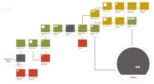
Figure 1 -
Workflow editorial edition.
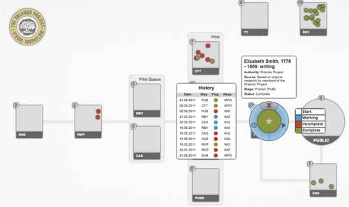
Figure 2 -
Workflow Orlando edition.